Using Grid Ruler for Neater Birst Dashboards
If you have spent any time creating an Infor Birst dashboard I would bet that you have spent hours fiddling with trying to get everything lined up to the pixel (or maybe that’s just me?). I’ve found a free Chrome extension that makes the process of lining up all my reports, KPI’s, and embedded filters a frustration-free experience.
Enter Grid Ruler, a Google Chrome extension. It is listed under developer tools and has a relatively solid rating at a hearty four stars from almost 300 reviewers. At over 80k downloads – it’s something people have definitely used to their advantage as well. Grid Ruler Chrome Extension page
Grid Ruler is a relatively simple browser add-on, but it has a powerful effect which I’ve outlined in the following three use cases which you may have encountered in your life as a Birst dashboard developer. Use Case 1 is about centering and positioning elements relative to the dashboard. Use Case 2 is about positioning elements relative to each other. Use Case 3 is about measuring in order to apply consistent spacing.
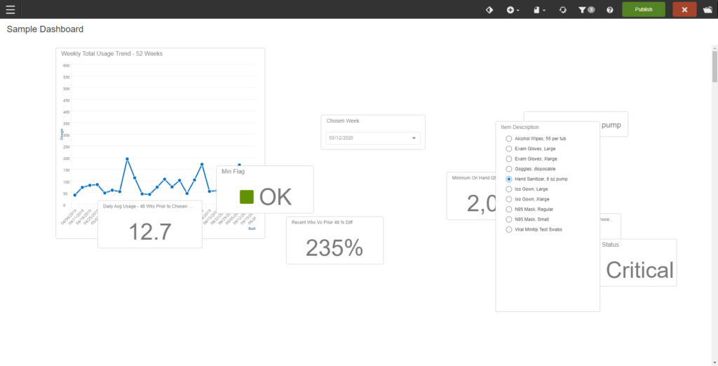
To start us off, here’s a simple dashboard I will use for demonstrating. As you can see, it contains two charts, an embedded filter, and a KPI. Don’t worry, this is from our sample space – it doesn’t contain any real customer data.
Use Case 1: Centering and Positioning Elements
So, let’s say we have a wonky visualization, a few KPI’s, and some embedded filters on a dashboard. You cranked them out quickly to get everything on the board so they’re in clusters. They aren’t symmetrical or placed with intention in any way, shape, or form. You sit here. You wonder how you got to this point in your life. You need to quickly fix this dashboard so you have slightly more time for your existential angst.
Luckily for you, fellow Infor Birst developers, Grid Ruler has got your back! All you have to do is start the add-on and you’ll notice that marked rulers have been added to your screen, like so:
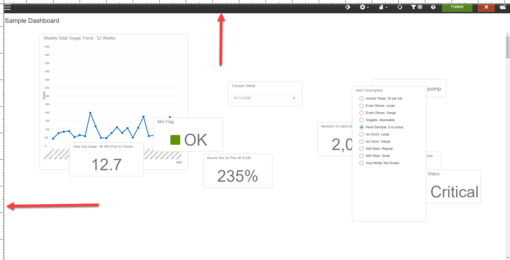
That may not be enough to help you follow specific lines down the screen to better align your content, however. All you have to do is move the cursor to either ruler, then click on the ruler and drag towards the middle of the screen. A cyan-colored line will be generated which you can drag it to wherever you want to leave it on the screen. It works for both vertical and horizontal lines – allowing you to center content both vertically and horizontally. I dragged some out, and now what we have is the following:
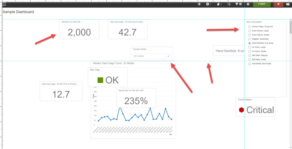
I’ve also shifted around two KPIs, the report and the embedded filter to try and start getting a better visual idea of where I want things to be. As long as you leave the lines where you’ve dragged them, you have a mark that you can work with. You can utilize them by leaving them to move your individual elements – or click on them and drag to reposition, if need be.
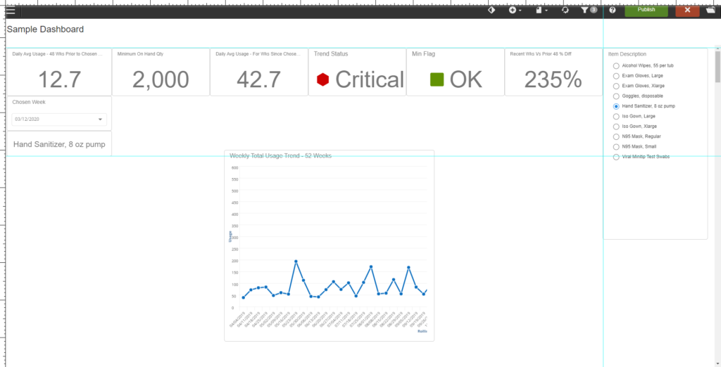
And voila! Take a look at that! Our KPIs are certainly in better shape, now! This may not eliminate the need for minor repositioning. Due to the way that elements move in relation to Infor Birst dashboards, it may be difficult to center DIRECTLY on a line you’ve already placed ahead of time – but it is a far cry from the amount of time that generally gets swallowed by this without a guide to go by.
If you dragged out a line that you want to get rid of, fear not. All you have to do to remove it from your screen is drag it back toward its origin and drop it when you reach the ruler. It will disappear.
Use Case 2: Positioning elements relative to each other
By the end of Use Case 1 the KPIs up top look nice and the embedded filters look pretty lovely but the line chart itself is not only sized incorrectly but it’s not really lined up with anything. Lets get Grid Ruler up and running and fix that!
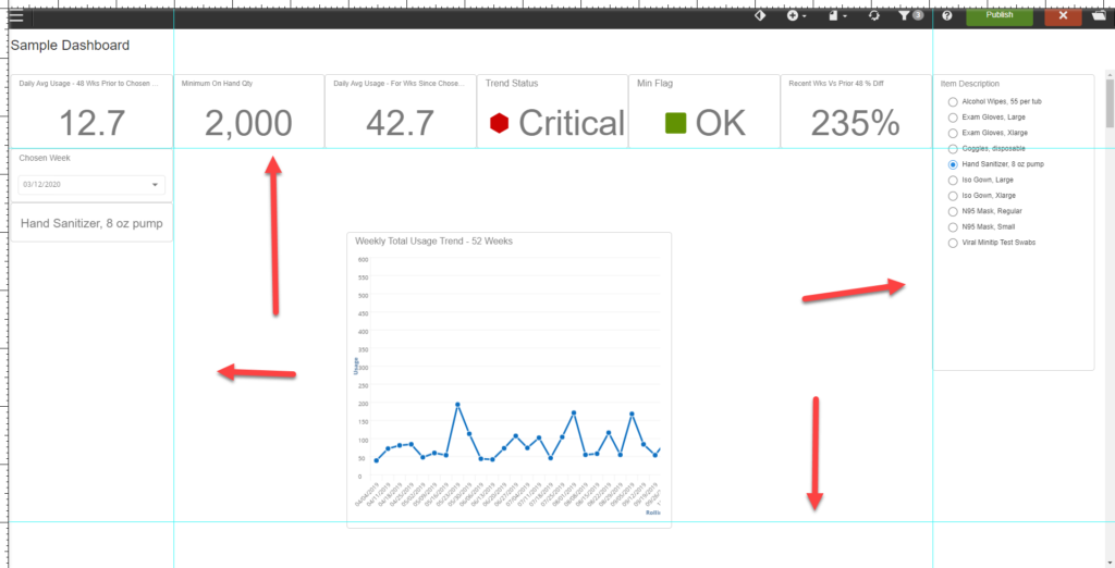
In this case, one has to think in reverse from the first use case. Instead of arranging grid lines on the screen where you want content to end up – drag the grid line out to meet the existing content. I’ve dragged out four grid lines with the intention of having the line chart sit flush on the sides with the embedded filters and the KPIs on top – and leaving a bit of white space at the bottom to keep things aesthetically pleasing without potentially becoming visually overwhelming for the user. Once that’s done – the chart can simply be dragged and dropped against the same line and resized to the correct dimensions – and you’ll have a dashboard that’s arranged in a visually appealing way.
In more complex examples, this is good also if you want content to be the same size.
Bonus Tip:
Another great method for making content the same size is to (temporarily) move the reports so they are stacked right on top of each other with the correctly sized one at the bottom of the pile. Adjust the size of the top one until it becomes the same size, move it off the pile, and then you can size the next one.
Simply drag the lines to meet the outside of the element that you’re looking to match and once they’re in place – you can resize the other element. I’ve had moments where I’ve gone back and looked at a dashboard I thought was done and found a sizing difference that perhaps wasn’t apparent to me when I was last working on it – I, for one, very much enjoy not having to deal with that anymore.
The rulers on the side can be used to resize content – which offers another option. If you don’t have any pre-existing idea of what size you want your elements to be – it can be a huge help.
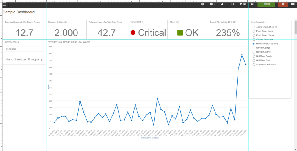
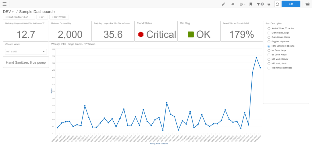
This dashboard sure is starting to shape up nicely! With our lines in place, we still have a generous amount of space on the left and right of the line chart in case we want to add more embedded filters or think of another KPI that the client might want to add. Our existing content, however, is starting to look like it was laid out with purpose in mind, which is good!
Use Case 3: Measuring in order to apply consistent spacing.
Before I begin this use case I would like to add in a caveat. Although Grid Ruler can and will give you an accurate pixel measurement of an element – it’s important to take into account that this is a measurement that is specific to your screen and the size of your window, among other things. Birst dashboards are designed to be responsive – meaning that depending on a user’s screen resolution, the layout WILL change dimensions and dashlets may be repositioned. Exact pixel measurements are good for things that require APPROXIMATE measurements: applying consistent spacing or using them if you want your reports to have a specific ratio (e.g. you want one report to be 2/3rds the size of the other report to fit in a KPI, etc). Despite how exact they are, they aren’t necessarily to be taken to the decimal, and the numbers themselves actually aren’t particularly useful outside of approximations and ratios.
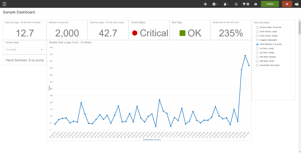
Now, while I do like how this is coming out, I would like to measure the length of the bar graph so that I can get an idea of how large it is in relation to the rest of my screen in case I need it for later when resizing other content because with the empty space in the margins of the dashboard – I might change my mind on what content I’d like there – but I really like the size of the chart as I feel it showcases the line in a more meaningful way. As a lot of us know – charts can indeed be sized in a way that makes them hard to read, or makes what they’re representing less meaningful.
If you click the intersection of the horizontal and vertical rulers, you will get the following:
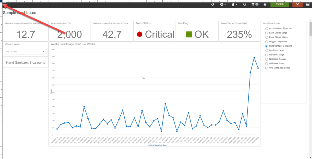
The square at the intersection will turn navy blue – and you are free to measure your elements in terms of pixels now. Simply click (Point A), drag and drop (Point B) where you want the beginning and end of the measurement to end up. A floating box will appear alongside the line to show you how many pixels you have down to the decimal point. In addition, the lines themselves have angled ends so that you can measure from top to bottom of something without losing where the end of the line is. You can also measure diagonally – and the line will change depending on how it’s measuring – making it easier to be aware of exactly what you’re measuring and how.
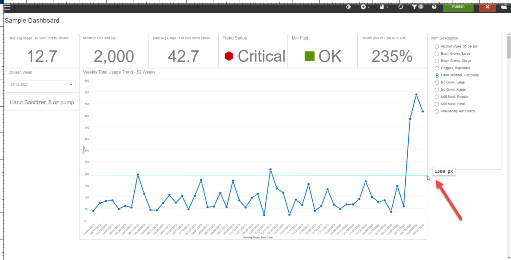
As you can see, the chart is 1308 pixels wide in relation to my screen which is 1920×1080. Please also bear in mind that we’re not interested in the actual number outside of recreating it on our own screen if need be (as it won’t necessarily appear the same on other screens for other users) or if we want to figure out a ratio on how to keep things the same size as the responsive design does its thing.
As a last bit of a tip – having these measurements is handy if you’re anything like me and tend to sometimes accidentally resize things without realizing it or lose work/save without meaning to. In that case, it would also be helpful to restore things.
Final Words
Grid Ruler is a wonderful Chrome extension that can be used to make your Infor Birst dashboards more aesthetically pleasing with less effort and guesswork on your part which is something most of us can get behind. Grid Ruler isn’t the only add-on that provides you with grid lines. There are others where you can swap the color of the lines (Cyan might be an issue if you were working on a dashboard whose company colors contained cyan, for example). A larger, overarching takeaway here, is that while we all have a tendency to get lost in the minutiae of our day to day and apps – there’s a whole world of addons out there that can be leveraged to ease your development process. Don’t be afraid to explore!
Happy developing!
-Chelsea Hansson


