Welcome to our article where we will discuss navigating Birst Visualizer, a powerful tool in Birst...
Keys to Successfully Creating a Birst PPE Inventory Dashboard Set in a Week, Part 1
Part 1: An Overview of the Project and the Birst Solution.
Personal Protective Equipment (PPE) has been in the news every day throughout the COVID-19 crisis. America has seen a critical shortage of items such as masks and gloves. So when the Infor Birst Services group approached Agile Dragon Consulting to ask for our help with this project tracking PPE for a hospital group we jumped at the chance. By following best practices we were able to rapidly implement this set of dashboards designed to track the availability and usage rates of PPE at this hospital group and deliver a finished product to their production environment in 7 days.
In this series of blog posts I will explain the needs of the users and what was developed, tell you why Birst was the perfect platform for this project, share the secrets to successfully completing this project in such a short time-frame, and show you exactly how we leveraged Birst’s technology to develop it.
Following the completion of this project, Agile Dragon Consulting anonymized the data, removing all traceability back to the customer or the original source. A separate example space was created so that this information could be shared without compromising data privacy in any way. In the few examples where the requirements or precursor spreadsheets are shown they will be clipped to hide any sensitive information. Otherwise all screenshots and examples in this and future blog posts will be from this example space, not from the actual client’s solution.
User Needs:
This multi-hospital group was facing the unprecedented challenge presented by the COVID-19 pandemic. As is common across the U.S., they had managed their PPE inventory using a very tight supply chain. In order to both control spending while ensuring enough inventory on hand of items like gloves, masks, and gowns, they have a minimum On Hand target (the goal is to never have less than that minimum) and a maximum On Hand amount (they are not allowed to order to many that they will exceed that maximum). While this had worked well for them under normal operating circumstances, circumstances were definitely not normal. They were seeing a massive increase in usage of these PPE items, and they knew that they were only at the beginning of the surge in need. It was a literal matter of life and death to ensure that they had enough of these items on hand to supply their medical workers and hospital patients with the items they would need to protect their health throughout the course of this pandemic and in the days beyond.
The Client’s Focusing Questions:
- Do we have enough of each of these critical items to meet the demand, given the recent surge in requisitions (usage)?
- How many days-worth of each item do we have on hand, given normal usage rates and given the recently accelerated usage rates?
- How many of each item do we have on order, and when will we receive it?
The Data:
The source data came from a 3rd-party (non-Infor) warehouse management system. The data extracts included targeted information about items (specific gloves, masks, hand sanitizer, test swabs, etc.), how many of each item were on-hand and on-order for each Warehouse, the Purchase Order history of these items for the past couple of years, and the Requisition history of these items for the past couple of years.
The Timeline:
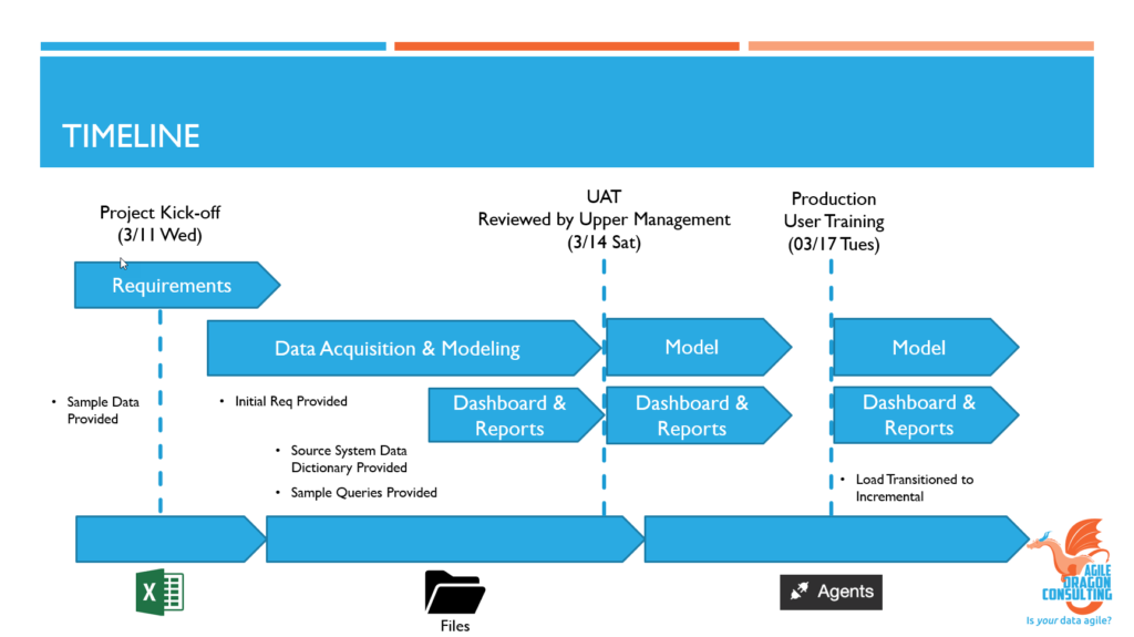
From the initial kick off with the client to the Go-Live date, the solution was in end users’ hands within one week!
The Dashboards:
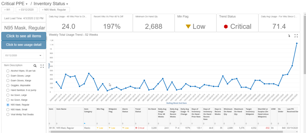
The primary dashboard is designed to show, for a single chosen item, important information about the recent daily usage rate when compared to the daily usage rate in the prior year, and use that information to predict whether there is enough of the item in stock.

Users can click a button on the Inventory Status dashboard to view a report showing an overview of this essential information for all critical items.

Another button will display a report with details about usage for the chosen item.
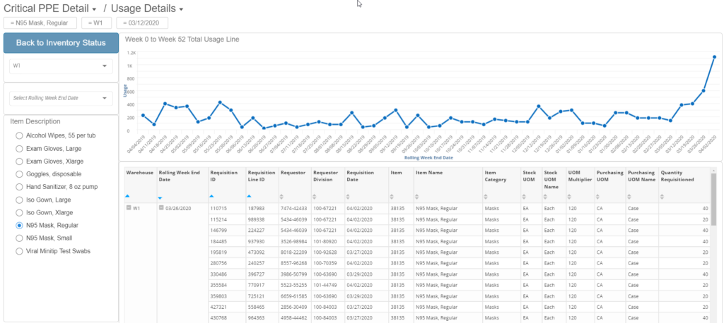
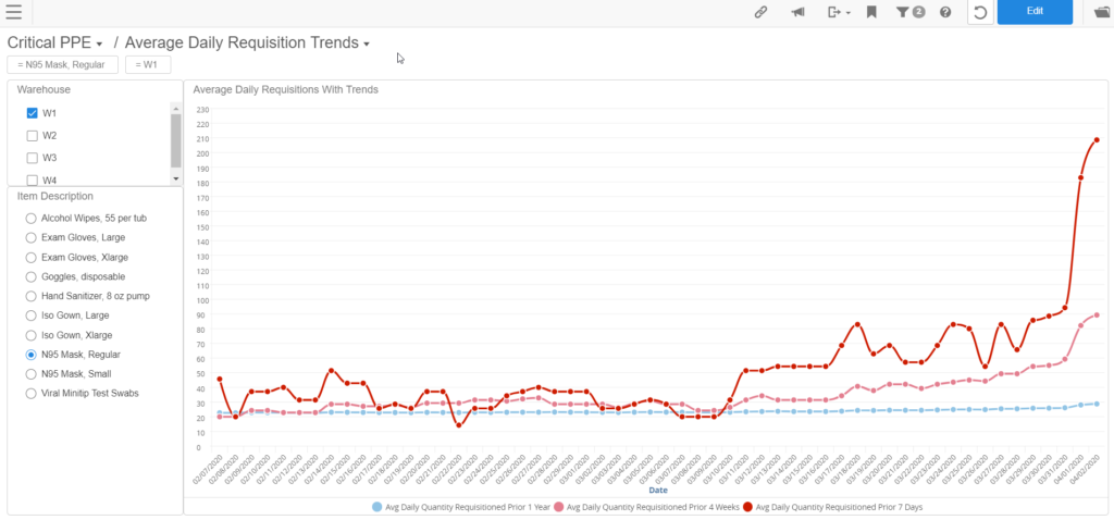
A deeper dive into requisitions shows how the daily average usage rate for an item has changed when looking at the past year, the past month, or the past 7 days.
Finally, their Procurement department wanted to have access to detailed reports related specifically to Warehouse Inventory, Purchasing, and Requisitions, so a dashboard was created to give them easy access to export these reports to Excel whenever needed.
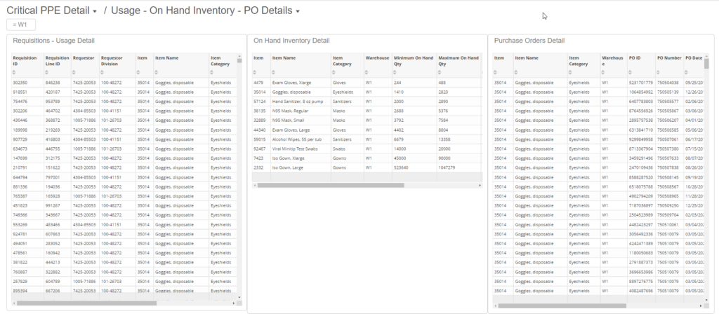
Filters: Filters on all dashboards allow users to choose a particular item or warehouse, or to change the time frame being visualized. Additionally, filters are available by Division and by Ordering/Requisitioning person.
Next Steps: In Part 2 of this blog series I will explain why Infor Birst was uniquely suited to be the perfect platform for the project. Part 3 will explore why we were able to succeed in completing this project on time and to the complete satisfaction of the client. Finally, in Part 4 I will lay out, step by step, exactly how the solution was developed using Infor Birst.

