In this article, I will demonstrate how to add images to a Birst dashboard. Adding images to a...
In this article, we will explore how to add KPIs to a Birst dashboard. We will walk through the steps to add KPIs, select the measure, adjust data formatting, styling the KPIs, add indicators, set conditional formatting, adjust indicator style, and save KPIs, edit KPIs, and finalize the dashboard.
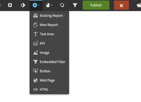
To begin, we click the plus symbol in the upper ribbon and choose KPI. This opens a new screen where we can pick the measure field, we want to use for our KPI. We can adjust additional settings such as data formatting, styling, title, and indicators. We can also add charts to our KPIs to show values over time. Once we have added our KPIs, we can adjust their size and edit them in the future if needed.
Key Takeaways
- Adding KPIs to a Birst dashboard involves selecting a measure field and adjusting data formatting, styling, title, and indicators.
- Charts can be added to KPIs to show values over time.
- KPIs can be adjusted in size and edited in the future if needed.
Entering Birst Dashboard
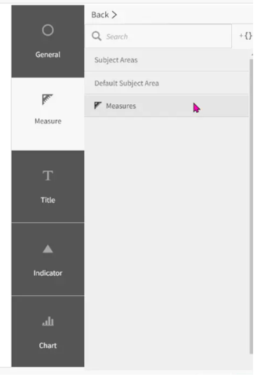 To add KPIs to a Birst dashboard, we need to click on the plus symbol in the upper ribbon. From there, we select KPI, and it opens a new screen. The first step is to select the measure field that we want to use for our KPI. Birst presents us with the measures that we have in space, and we can select the one we want. For example, we have a measure called net amount, and we can choose that to be our KPI for this dashboard.
After selecting the measure, we can adjust additional settings such as choosing the sum, average, counts, Min, or Max of that measure. We can also choose the data formatting, such as showing the KPI in millions instead of the full number. We can adjust the styling, such as font color, font type, and title. We can turn on the title and change it to say net amount. We can also add indicators, which allows us to set conditional formatting. For example, we can set the indicator to be green for anything above 8 million and red for anything below 8 million.
We can also add charts to our KPI, such as a spline chart to show values over time. Once we are done with the settings, we can simply click save, and our KPI will be added to the dashboard. We can adjust the size of the KPI and move it around the dashboard as needed. If we ever need to edit it in the future, we can simply come back and choose “Edit”.
Adding KPIs
To add a KPI to a Birst dashboard, we need to follow a few simple steps. First, we click on the plus symbol in the upper ribbon and select KPI. This will open a new screen where we can select the measure field that we want to use for our KPI.
We can choose from the measures presented in the default subject area for the space. For example, if we select the "net amount" measure, we can adjust some additional settings such as the data formatting, styling, and title. We can also add indicators to show whether the value is good or bad.
If we want to add charts to our KPI, we can do so by selecting a spline chart to show values over time. Once we are satisfied with our KPI, we simply click save, and it will be added to our dashboard.
It is important to note that we can always come back and edit our KPI if we need to make changes in the future. By following these simple steps, we can easily add KPIs to our Birst dashboard and monitor our data more effectively.
Choosing Measure Field
To add KPIs to a Birst dashboard, we need to select the measure field that we want to use. First, we click the plus symbol in the upper ribbon and choose KPI. This opens a new screen where we can pick the measure field from the default subject area for our space.
For example, we can select the "net amount" measure and adjust the data formatting to show it as millions instead of the full number. We can also adjust the title, font color, and font type to customize the KPI.
Additionally, we can add indicators to our KPIs to show whether the value is good or not. We can set a conditional formatting threshold, such as 8 million, and choose a green up arrow indicator for values above the threshold and a red down arrow indicator for values below it.
Once we have customized our KPI, we can save it and add it to our Birst dashboard. We can adjust its size and position as needed and edit it in the future if necessary.
Overall, choosing the right measure field is crucial for creating effective KPIs that provide valuable insights for our Birst dashboard.
Adjusting Data Formatting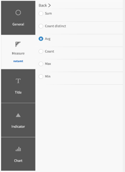
In this session, we will explore how to add KPIs to a Birst dashboard. To do this, we will need to click the plus symbol in the upper ribbon and select KPI. This will open a new screen where we can pick the measure field that we want to use for our KPI.
Once we have selected our measure, we can adjust the data formatting. We can decide how we want our KPI to be displayed, such as showing it in millions instead of the full number. We can also adjust the styling of our KPI, such as the font color and type.
Another useful feature of KPIs is the ability to add indicators. We can set conditional formatting so that anything above a certain value will be green and anything below will be red. We can also adjust the indicator style, such as using an up arrow to indicate that it is good for our dashboard.
After adjusting the data formatting and adding any necessary indicators, we can save our KPI, and it will appear on our Birst dashboard. We can then adjust the size and position of our KPI as needed. If we ever need to edit it in the future, we can simply choose “Edit”.
Overall, adjusting data formatting for KPIs is a simple process that can greatly enhance the visual appeal and usefulness of our Birst dashboard.
Adding Indicators
To add KPIs to a Birst dashboard, we need to click on the plus symbol in the upper ribbon and select KPI. This will open a new screen where we can select the measure field that we want to use for our KPI. We can choose from the measures available in our default subject area, and select the one we want to use, such as net amount.
Once we have selected the measure, we can adjust additional settings such as data formatting, styling, and title. We can also add indicators to our KPI, which are useful for highlighting performance thresholds. For example, we can set a threshold of 8 million and anything above that will be green, while anything below will be red.
To adjust the indicator style, we can use the conditional formatting option and select the measure we are using. We can also add charts to our KPI, such as a spline chart to show values over time.
Once we have made all the necessary adjustments, we can save our KPI and add it to our dashboard. We can then edit the dashlet information to turn off any default titles and apply our own custom title.
Overall, adding indicators to our KPIs is a useful feature that allows us to easily monitor performance thresholds and make data-driven decisions.
Setting Conditional Formatting
In this session, we will explore how to add KPIs to a Birst dashboard. To add a KPI, we need to click on the plus symbol in the upper ribbon and select "KPI". This will open a new screen where we can pick the measure field that we want to use for our KPI. We can select our desired measure from the presented measures in the default subject area. For example, if we want to use the "Net Amount" measure, we can select it.
Once we have selected our measure, we can adjust some additional settings. We can choose to see the average, count, min, or max of that measure. We can also adjust the data formatting to show the KPI in millions instead of the full number. Additionally, we can customize the styling of the KPI by adjusting the font color, font type, and title.
One useful feature of KPIs is the ability to add indicators. We can set a condition for the indicator to change color based on the value of the KPI. For instance, we can set our indicator to turn green if the value is above 8 million and red if it is below 8 million. We can also adjust the indicator style, such as using an up arrow to indicate a good value.
We can add charts to our KPI, such as a spline chart to show values over time. Once we are satisfied with our KPI, we can save it and add it to our dashboard. We can also adjust its size and position on the dashboard.
To edit our KPI in the future, we can simply select "edit" and make any necessary changes. By following these steps, we can easily add and customize KPIs on our Birst dashboard.
Adjusting Indicator Style
To adjust the style of an indicator in a Birst dashboard, we need to follow a few simple steps. First, we click on the plus symbol in the upper ribbon and choose KPI. This opens a new screen where we can pick the measure field that we want to use for our KPI. We can select the measure from the default subject area and adjust it to show as Millions instead of the full number.
We can also adjust the styling of the KPI, such as the font color, font type, and title. We can turn the title on and change it to something more descriptive, like "Net Amount." Additionally, we can add indicators to our KPI by selecting the measure we are using and setting conditional formatting. For example, we can set the indicator to be green for anything above 8 million and red for anything below 8 million.
Once we have made all the necessary adjustments, we can save our KPI, and it will appear on our dashboard. We can then move it to the desired location and adjust its size if needed. If we ever need to edit the KPI in the future, we can simply choose “edit”.
Overall, adjusting the indicator style in a Birst dashboard is a straightforward process that allows us to customize our KPIs and make them more visually appealing and informative.
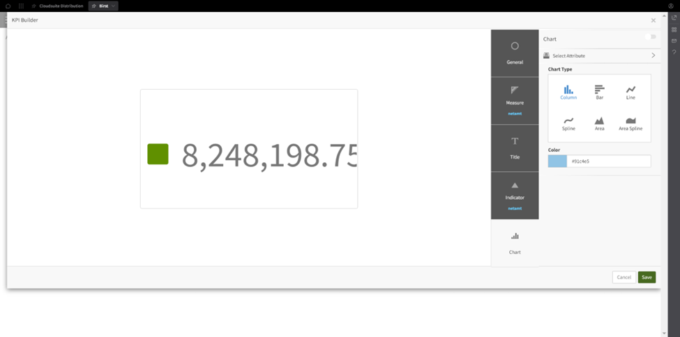
Adding Charts
In this session, we are going to explore how to add KPIs to a Birst dashboard. To add a KPI, we need to click on the plus symbol in the upper ribbon and choose KPI. This will open a new screen where we can select the measure field that we want to use for our KPI. We can choose from the measures available in the default subject area for this space. For example, we can select the "net amount" measure.
Once we have selected the measure, we can adjust some additional settings. We can choose to see the average, counts, minimum, or maximum of that measure. We can also choose how we want to format the data. For instance, we can decide to show the KPI in millions instead of the full number.
We can also adjust the styling of the KPI, such as the font color, font type, and title. We can even add indicators to the KPI. For example, we can set a conditional formatting rule that will turn the indicator green for anything above 8 million and red for anything below 8 million. We can also choose the style of the indicator, such as using an up arrow to indicate that it is good for this particular dashboard.
If we want to add charts to our KPI, we can choose from different chart types, such as a spline chart to show values over time. However, since we are only using one measure, we will leave this alone.
Once we are done with the settings, we can simply click save, and our KPI will be added to the dashboard. We can then adjust its size and position on the dashboard as needed. If we ever need to edit it in the future, we can simply come back and choose “Edit”.
That is how we can add a KPI to a Birst dashboard.
Saving KPI
To add a KPI to a Birst dashboard, we need to follow these steps:
- Click the plus symbol in the upper ribbon and select KPI.
- Pick the measure field that you want to use for your KPI.
- Adjust additional settings such as data formatting, styling, and title.
- Add indicators to your KPI, such as conditional formatting to indicate good or bad values.
- Save the KPI and add it to the dashboard.
It is important to note that we can also add charts to our KPI to show values over time, but this is optional. Once we have added our KPI to the dashboard, we can adjust its size and position as needed. If we ever need to edit the KPI in the future, we can simply choose to edit it. With these steps, we can easily add a KPI to our Birst dashboard and improve our data visualization.
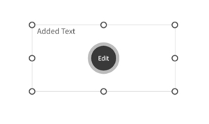
Editing KPI
To add a KPI to a Birst dashboard, we need to click on the plus symbol in the upper ribbon and select KPI. This will open a new screen where we can pick the measure field, we want to use for the KPI. We can select the measure from the default subject area and adjust the data formatting, styling, and title.
One of the useful features of a KPI is the ability to add indicators. We can set conditional formatting to show a green indicator for values above a certain threshold and a red indicator for values below that threshold. We can also adjust the indicator style to suit our needs.
Once we have created the KPI, we can save it and add it to our dashboard. We can adjust the size and position of the KPI on the dashboard as needed. If we ever need to edit the KPI in the future, we can simply choose “Edit”.
Overall, adding a KPI to a Birst dashboard is a straightforward process that can provide valuable insights into our data.
Finalizing Dashboard
In this session, we explored how to add KPIs to a Birst dashboard. To add a KPI, we clicked on the plus symbol in the upper ribbon and chose KPI. This opened a new screen where we picked the measure field that we wanted to use for our KPI.
We selected the measure called "net amount" and adjusted some additional settings, such as data formatting, styling, and the title. We also added indicators to show whether the value is good or not. For example, we set the indicator to be green if the value is above 8 million and red if it is below.
We could also add charts, such as a spline chart to show values over time, but since we were only using one measure, we left that alone. After making all the adjustments, we clicked save, and the KPI was added to the dashboard.
We then edited the title and information of the KPI dashlet to make sure it looked good on the dashboard. Finally, we moved the KPI to the upper right of the dashboard and adjusted its size.
Overall, adding KPIs to a Birst dashboard is a straightforward process that can help us visualize important metrics at a glance.
Learn at your pace

Dragon Den is an Agile Dragon Group community focused on all aspects of Birst knowledge and development. Whether it is our free content or our paid training, we are here to support you throughout your Birst journey, from building your first dashboard to building your Birst solutions.

- Creating dashboards
- Creating reports
- Adding filters
- Manage user access